The Process of Designing for Hikers: The View from the Top
Presented by Benjamin Fornia, Erin Ripple, Saurabh Sharma, and TJ O’Connor
Your Design researchers, UX designers, UX researchers
When we interviewed hikers at the start of this project, they all expressed similar frustrations with existing tools when it comes to planning a hike. They were unable to find crowd and weather predictions that would help them plan when and where to hike, and they often had trouble finding a local community of hikers with similar skill level to hike with. Not only did this make planning and preparing for hikes more difficult, but as one interviewee put it, “it would deter me from even going for the hike at all”.

Solution
Ideally, our design would be a way for hikers to share their experiences and learn from others, connect with friends to plan group excursions, and plan ahead with the information they need for a safe and enjoyable hiking experience. We came up with a mobile application to solve these common problems faced by hikers. The first function that the application provides is to determine when and where to go for a hike using weather, crowd data, intended hike difficulty, and other trail info. Earlier, hikers faced the frustration of juggling between different platforms and websites to plan their hikes. Using our TrailHead application, they will be able to search for trails and filter them according to their own preferences, including user-provided reviews. They can also view the exact trail conditions such as snow-overlay on specific parts of the trail, and see how these conditions change over the day. To solve the problem of finding potential hiking partners to hike with, users can find friends on the application by searching for them or reading their reviews, and then see their expertise in hiking, the hikes they have been to, as well as chat and plan future hikes with them.
Paper Prototype, Testing Process, and Results

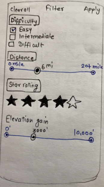
In developing our initial paper prototype, there were lots of features that we wanted to include; we were interested in using our design not only to convey information to hikers and allow them to connect with other hikers, but also to collect data from them to refine the data we had about hiking trails. Because of this, our prototype included flows to report the weather conditions after finishing a hike (Figure 1) and to report parking availability using a touchscreen monitor located at the trailhead (Figure 2). However, in testing, we found that by trying to include so many features in our design, we were losing track of important elements of the interface. In a heuristic evaluation of the prototype, it became clear that there was a lack of user control in our interface design. An example of such limitations was the absence of a “back” button on some screens where it would be useful in navigating through the app (Figure 3). As we continued designing, we took steps to fix these issues and make the process more intuitive for the user. This was part of an ongoing process of adding small details and removing unnecessary ones in the interest of streamlining our design.

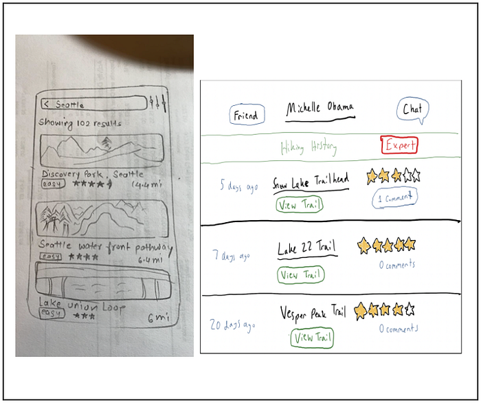
Our participants in usability testing provided even more insight into ways that the design could be improved. We conducted three tests with volunteers from our households, giving them tasks to complete using the prototype and minimal context from the facilitator. By watching their process, we determined several details that needed changing: there was no distinction made between distance to a trail and the trail length in filtering for “distance,” so we added a “distance from you” filter for clarity. Users also still needed improvements to user control — our ‘filters’ page didn’t offer an option to go back without applying any filters, creating a “dead-end” (Figure 4), and necessitating the addition of a back button. We also found that we needed to distinguish more between design elements based on their use, for instance, a button marked “done” that allows the user to close a popup should be visually distinct from a set of weather conditions the user selects from (Figure 1). Lastly, we simplified our home screen. The “Friends” tile from our original design, which attempted to serve the dual purposes of providing information about the user’s friends and acting as a button that leads to the “Friends” page of the app, was too cluttered and confusing for our participants, and we decided it was ultimately unnecessary. Instead, we just used a button marked “Find friends.” Overall, the prototyping and testing process encouraged us to narrow down our design and find the simplicity that would make it effective and intuitive for users.
Digital Mockup
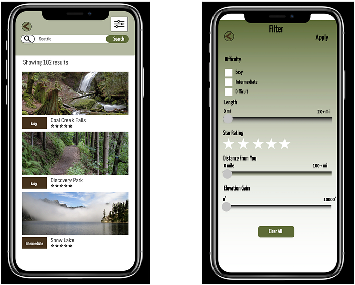
The first task our mobile application supports is determining when and where to go hiking using weather, crowd data, intended hike difficulty, and other trail information. From the home page, with or without logging in, you can use the search bar to find trails (Figure 5) and apply or remove filters using the filters icon (Figure 6). These filters refine the results of your search using difficulty, trail length, and other attributes.
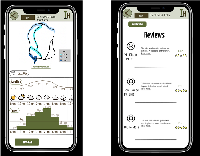
From these results, you can select a trail to see more details. This includes a map that has an optional snow overlay and a double histogram displaying the weather conditions and crowd level in parallel at different times throughout a selected day (Figure 7). Users can also read and write trail reviews (Figure 8). Through these features, users are able to select the best place and time to go hiking.
The second task our mobile app supports is helping users find friends to hike with using experience level, as well as their hiking history. Once a user is logged in, they can access a “Find Friends” button (Figure 9) that allows them to search for people by name and shows a list of everyone currently on their friends list (Figure 10).
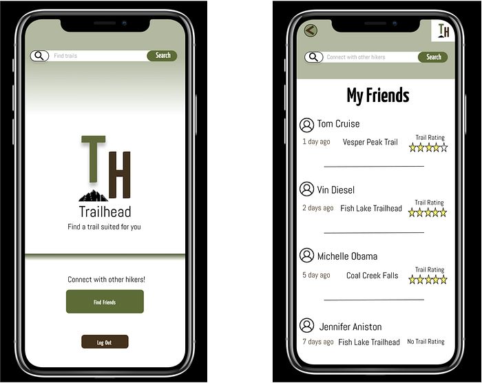
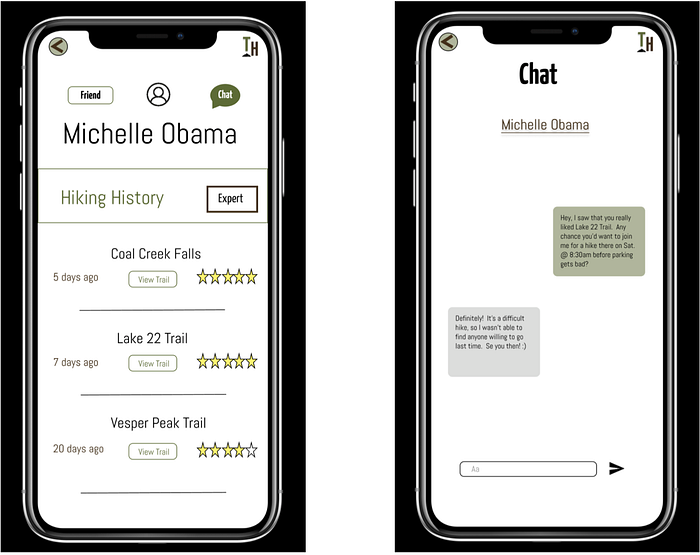
By searching their friends list or the wider user base, they can access a person’s profile page, which has the individual’s hiking history and experience level (Figure 11). From there they can connect with the individual by adding them as a friend and can chat with them to plan a hike together (Figure 12). In some cases, hikers want to plan when and where to hike based on who they are hiking with or based on a friend’s suggestions. Our app supports this other dimension of planning a hike by giving context of where a person has hiked, the difficulty of the trail, and reviews. In this way, we not only help hikers plan a hike, but we help them to connect with other hikers and create a local community.
From the preliminary to the final digital mockup we incorporated feedback to improve consistency and clarity. The first major change we made was making sure non-interactive labels were visually different from the buttons. We also showed a visual system status change for the “Edit Review” button to show that editing could only be done after adding a review. The second change we made was making labels more consistent across the app. In different places we were using “moderate” and “intermediate” to mean the same thing, so we switched to “intermediate” across the entire app. Additionally, for transparency and visual appeal, we made the login and signup buttons bigger and removed duplicated functionality with the “Close” and “Close Popup” buttons on the same page. We also added numbers and “ppl” to the crowd histogram to make it more clear what the data represents. The final change we made was adjusting pages with part of the text cutoff by the phone screen format.
Final Digital Mockup: https://www.figma.com/file/rEhZqfUhrCKjUsIn3BZCLF/Final-Digital-Mock-up?node-id=0%3A1
The process of getting our design right was just that — a process. Every aspect of our design changed as we progressed further with it. Our problem statement changed as we interviewed people, from designing something to help make the process of getting into hiking easier to making a design to allow hikers of any experience level to find new hikes and connect. Our design itself changed from a complex web of reviews and data collection to a simpler search engine with a friends list and trail-specific data. We imagine this app as a tool for hikers to form a community — to find trails that others enjoy, plan trips with their friends based on weather and crowd data, and connect with the people they meet while hiking.