Saving Energy Should Be Easy
By Sierra Lee (UX Researcher), Tyler Nguyen (Designer), Yu Hao Wong (Ideator)
Vague energy bills. Lights left on. Energy wasted. Sound familiar?
The Problem
From AC/heating, lighting, kitchen equipment, personal electronics, we all use energy in our homes. However, with changing appliance usage patterns, especially considering the extreme temperature and seasonal patterns we have recently faced, people are becoming more cognizant of their energy usage. In particular, people are becoming increasingly concerned with how they are wasting energy in their home. From our user research, we have identified that, when it comes to energy waste, people most often struggle with awareness of how they use their energy and with controlling their appliances when they are not physically present (whether because they are outside of the home or too lazy to navigate to the appliance in question).
Our Solution
Introducing UtiliMe, an IoT solution that enables smart control of appliances and aggregates usage metrics for helpful, actionable insights. UtiliMe consists of an intentionally simple user interface — this product is easily consumable to the average person, no technical experience or knowledge required. In its current iteration, UtiliMe gives users metrics based on usage time for each appliance in their home, but we intend to calculate more metrics and create more data visualizations for users to help them get a fuller picture of how they use their appliances. Additionally, we allow users to gain more control over their household and energy use by letting them remotely control their appliances — with one click they can easily turn a desired appliance on or off. No more fretting over that light you accidentally left on! This is all accomplished with a smart plug that users plug their appliances into. Together with the software components, we empower users to take control of their household energy use.
Paper Prototyping
To begin our user research process, we decided on what main tasks we wanted the first iteration of our product to achieve. We came up with two main tasks that we felt encompassed our vision quite well.
- Remotely turn off a desk lamp from our interface
- View and report back to us usage metrics for a portable AC
Guided by these two tasks, we felt that we would be able to explore both giving users helpful usage insights as well as giving them a tangible way to take control of their appliances. Here is an overview of our paper prototype screens:
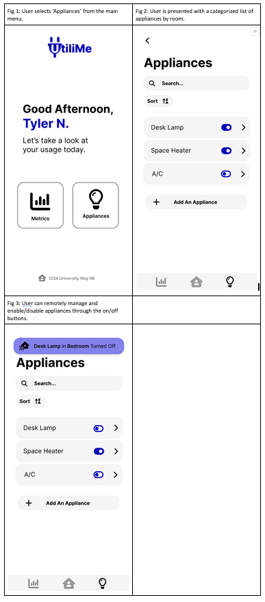
Task 1: Remotely turning off a desk lamp.

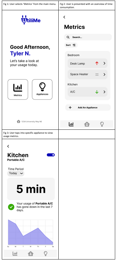
Task 2: Viewing and reporting back usage metrics. There are two ways that users can do this. Here is the first way, which involves going through the “Metrics” tab.
Here is the second way, which involves going through the “Appliances” tab.
Usability Testing Results
We were able to recruit a relatively diverse group of three participants to test our prototype. One was a UW student, one was a high school student, and the last was a working adult in the Seattle area. For the high school student, we conducted the test online through Zoom, so we digitized our paper prototype in Marvel, which you can see here.
Most of the feedback we got from the participants were quality of life changes, such as a back button and more feedback for when an appliance is turned off. We also got feedback on the general look and feel of our UI. One notable piece of feedback we received was on our metrics page. We originally wanted our metrics page to show a change in appliance usage in terms of watt-hours, but to our participants, a number like this didn’t mean anything useful to them. In fact, one of our participants asked what “Wh” stood for! Given this feedback, we decided to completely remove the watt-hour metric, which we thought was a big change.
However, we had seen that, overall our interface made sense and was interpreted to be understandable and easy to consume. This was our goal from the very beginning. The next step included making the changes we noted above in the form of a digital mockup that we could use for more in-depth usability testing.
Digital Mockup
After revising our paper prototypes, it was time to move onto higher fidelity prototyping. Creating a digital mockup was naturally the next step. When we implemented our digital mockup, we did not change much from our paper prototype aside from a few things that didn’t seem to look right digitally. We also added simple changes that we mentioned above, like adding a back/home button. Most notably, we maintained the simplicity of our paper prototype, since we realized that simplicity could help set us apart from similar products more. We tried to incorporate the feedback we received from our usability tests as much as possible, but as previously mentioned, some things didn’t make sense when we tried to implement them digitally. For example, we had received some feedback that it was hard for users to discern between different appliances based solely on name. From this, we thought about adding icons for each appliance, but found that doing so caused too much clutter.
We made our digital mockup in Figma, linked here.
Here is a picture of the overall mockup, including an idea for the hardware component:
Task 1: Remotely turning off a desk lamp.
Task 2: Viewing and reporting back usage metrics.
An important and interesting piece of information we learned from our testing was that, sometimes, you have to trade seamlessness and simplicity in order to give feedback to the user. As we’ve mentioned, one of the key features of our product is to allow users to remotely turn off/on appliances. During our initial design, we tried to make this as easy and simple as possible: all users had to do was toggle on/off for that appliance! However, during testing, we realized that this did not provide enough feedback for users. Many of our testers were not convinced that they had actually turned off the desk lamp. So, we added a banner that comes down when users switch the toggle to assure them that their appliance was successfully turned off/on.
In regards to the second task, we kept those workflows mostly the same. However, we changed the icons that indicate whether usage has gone up or down (from check mark and exclamation mark to colored arrows) to make it clearer and more intuitive to users how their usage has changed. As for what we changed between our original mockup and this final one, we decided to add a simple line chart to the individual appliance metrics to help users visualize their usage better over a period of time.
Now and What’s Next
Designing UtiliMe has been a fun ride. We conducted lots of user research with our prototypes and through that whole process have identified a few key themes:
- People struggle with utility use because it is not easy to remotely control and monitor appliances.
- Simplicity is everything for the modern, average user.
- Feedback mechanisms, like confirmation messages, to reassure the user are important and often necessary.
While we are proud of our progress and believe that UtiliMe in its current state has the potential to make saving energy in the home a lot easier for many users, we know there’s a lot more we can do. For one, we would want to consult an electrical engineer who can help us refine the hardware portion of our solution. We also want to iterate on the current analytics and metrics we provide to users so that we can give even better and actionable insights.
Thanks for your time, and we look forward to the future.