MyC: Contraceptive Planning Made Simple, Online.
By Juan Gonzalez, Henry Zhuo, Owen Du, Vaibhav Bakhshi
Why contraceptives?
Around half of the pregnancies worldwide are unplanned and over 95% of those unplanned pregnancies result from a lack of contraception or misuse of contraception. This creates sustainability challenges on a personal level, emotional and financial, but also on an environmental level due to the finite natural resources. To understand unplanned pregnancies better and the factors that contribute to the lack or misuse of contraception, our group conducted a series of interviews and surveys on young adults between the ages of 18–24, primarily across North America, but also Europe and South America to understand barriers to contraception use. What we uncovered was fascinating: while most young adults had a detailed understanding of the functionality of different contraceptives, young adults experienced challenges in communicating contraception use with their partners and, at a much higher rate, felt a financial barrier in covering the cost of contraception. From our user research, we found that lack or misuse of contraception was largely an accessibility issue on two fronts: building contraceptive plans with partners and the financial strain to access contraception.
Challenges in Accessing Contraception

Solution
Prototyping: Paper
In building our design, we followed an iterative spiral design process transitioning from simple sketches to building physical paper prototypes. For our paper prototype, we created a simple design that had our onboarding survey to start using the app and then our 3-page design setup: Home page, split costs page, and view plans page. Our main focus when building the paper prototype was to ensure that users were able to understand and navigate the different functionalities of the app and to identify areas of confusion for users. To do this, we conducted user testing by providing the following scenario:
“You and your partner are confused about what contraceptive plans would work best for the both of you and also want to ensure the cost of contraception is split evenly between you both. You decide to use our design which helps you build personalized contraceptive plans with your partner and share the cost of contraception with them.”
Then, we asked our users to perform the following tasks while narrating their thought processes and emotions:
1. Complete the onboarding survey to share contraceptive history and preferences
2. Connect with your partner
3. Browse personalized contraceptive plans that are suited to your needs
4. Explore a specific plan to learn more about its metadata and customer reviews
5. Choose a plan and Split Costs with your Partner, view itemized receipt

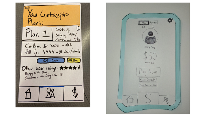
We performed the user testing on 4 sets of users and made note of any challenges and confusion the users encountered when walking through the assigned tasks. Within our onboarding survey, we had a “More” pop-up button for users to learn more about the specific contraception.
However, within all our user tests, we noticed there was inconsistency between what we expected the more button to do and what users expected the more button to do: users expected the more button to generate more options as is consistent in other external systems.
While our design had a navigation bar to go between the home page, split costs, and view plans page, we realized users tended to use the home page shortcuts to go between these pages instead of the navigation bar. This created friction in using the app seamlessly and created ambiguity in emergency exits out of a page. So in our next design iteration, we had to add more color and emphasis to highlight the page a user was currently accessing to give more power to the navbar. Finally, when users were browsing a specific plan, we noticed that they would voice a sense of overwhelm by the abundance of information, text, and buttons on a page. Our split cost task test, however, was quite successful for our users because we were using affordances from popular app designs like Venmo and CashApp so users were familiar with how to use that functionality.
Upping the Fidelity with Iteration: Digital Mock-Up
After conducting a thorough evaluation of our paper prototype, we were ready to take the findings from our user tests and implement them into the next iteration of our design where we also upped the fidelity: a digital mock-up.
There are four components in our digital mockup. The first is the “Getting Started” personalization survey for the app to understand an individual’s contraceptive preference by analyzing historical and current preference data. The second is the home screen where you can connect with partners, update your profile (including updating your initial survey responses), and update billing and payment information. The third is the “Connect with Your Partner” screen to view and choose personalized contraceptive plans designed for a user and their partner. The fourth is the “Split Costs” screen to view itemized contraceptive costs that can be split.
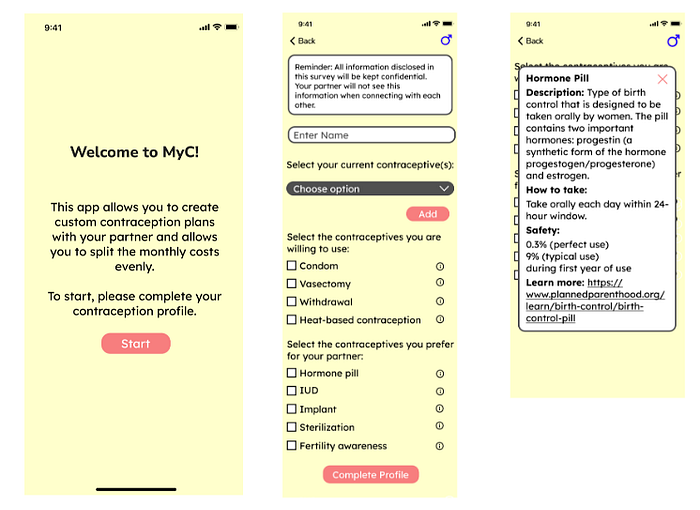
The first task in our digital mockup is finding personalized contraceptive plans for your partner and yourself. To start, users fill out a quick onboarding survey for users to gather data on contraceptive history and preferences. Once a user completes their profile, they’re brought to a home screen where they can view partner requests, current plans, past transactions, and other contraceptive plans. To view a comprehensive list of personalized contraceptive plans, users can either “see all” under other contraceptive plans or go to the third page on the navigation bar. Here they can set custom filters while browsing plans, read more about a plan, share a plan, and choose a plan. If a user is not connected to their partner yet, they will be prompted to do so. The biggest changes in performing this task from our preliminary mockup is an information icon for a pop-up bubble to learn more about a specific contraceptive, having an emergency back button in every part of the task (top left), and having metadata about a specific plan larger in size with a single “Add Plan” button.
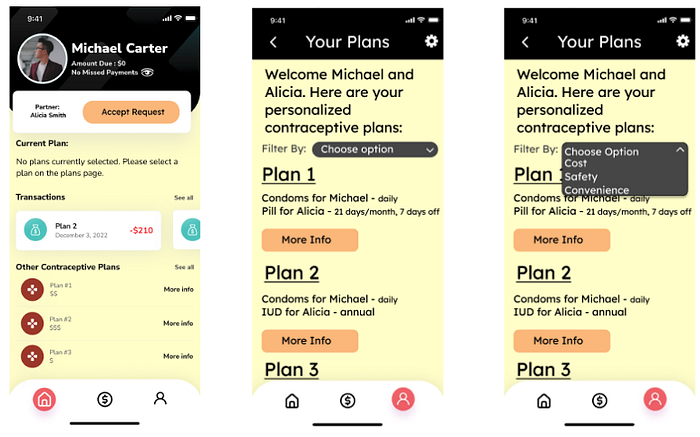

The second task is to allow partners to split costs for a specific contraceptive plan. Users can go to the second-page tab to split costs. Here they will have information on the money each partner owes, itemized receipts (“view details” button), view past transactions, and change payment methods through the settings on the top right. The biggest change in this task from the preliminary mockup is the added opportunity to see past transactions and edit/modify payment methods.
What’s Next For MyC
We are incredibly excited to share with you the first milestone for our design in making contraceptive planning simple. At the start of our project, we recognized an accessibility gap in contraception use which bolstered unplanned pregnancies. Through our interviews and surveys, we identified key challenges in contraceptive planning and the financial burden of contraceptives that led to the lack/misuse of contraceptives. With this information accessible and diminished financial burden, we believe that we will strongly increase the proper use of contraception and reduce the incidence of unplanned pregnancies creating a more sustainable future for individuals and the environment. Going forward, we want to integrate insurance options to further reduce the cost of contraceptives and increase access, but that’s for milestone two!
Summary
MyC is a mobile app where users can not only find personalized contraceptive plans that suit their partner and their preferences but also have the functionality to split the cost of contraception so as to share the financial cost associated with contraceptives. To create personalized contraceptive plans, we conduct a short onboarding survey to collect data about a user’s contraceptive history and preferences. Following completion of the survey, a user can connect with a partner (who must also complete the onboarding survey). Once partners are connected, our design uses the onboarding survey insights to develop data-driven contraceptive plans that suit the preferences of both partners. These personalized plans can be filtered on 3 criteria: cost, safety, and convenience. We called this app MyC as it’s a one-stop app for all your contraceptive needs. The interface is simple and transparent to maximize trust, safety, and accessibility for our users.