HearAtHome: An Ear to Hear for Those Who Can’t
Mallory Johnson, Jacob van’t Hoog, Maurice Montag, Khoa Nguyen
Our Goals
Our goal with Hear At Home was to create a product to assist parents who are Deaf or Hard of Hearing (DHH) in the home. The major problem that we decided to tackle was awareness of sound cues and events that take place in the home. A door or window opening a few rooms over, water running, a baby crying… these are all sound cues, some quite urgent, that allow individuals to have an idea of what is happening in their home. DHH people may miss these cues, or in the case of individuals with single sided deafness, may hear the sounds but be unable to properly locate them. Another problem we centered on was childcare tasks. Being able to locate children, and make sure of their safety, is of utmost importance for busy parents. The lack of aural spatial awareness in DHH people can make these tasks more difficult, which is why we chose these problems for our project.

Our Team
The HearAtHome team is made up of four students, Mallory Johnson, Jacob van’t Hoog, Maurice Montag, and Khoa Nguyen. We are all computer science undergraduates at the University of Washington. Our objective is to create technology that can make the world more accessible to people of different backgrounds, in this case DHH people.
Our Product
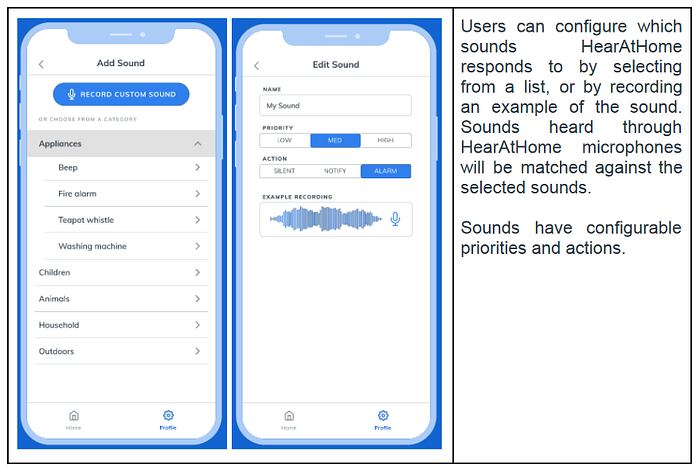
The solution we created is HearAtHome, a smart-home network designed to assist DHH parents. HearAtHome uses a network of sensors placed around the house, including inexpensive microphones and door-mounted sensors. These sensors connect with smart-home systems and the HearAtHome app, and work in coordination to detect and locate sounds in the home. Users can customize and choose what sounds they want to be aware of. They will then receive notifications when a sound requires their attention, with easily accessible information related to the sound. Users can also view a list of ongoing sounds and activities, making it easier for parents to keep track of multiple children. With a few sensors and your existing smartphone, HearAtHome can transform your living space into a smart and more accessible home.
Testing with Paper Prototypes
As a cheap way to do rapid prototype testing we created a paper mockup of the phone application. We uploaded our sketches to Marvel (link) to make the mockup interactive and available online. Because of the pandemic and time constraints we were not able to test with anyone who was DHH, but all of our participants were parents. One of our group members gave our participants a bit of background on the app, then prompted them to complete to tasks. The team members then observed the participants and were able to take notes on how they interacted with the app.

Once testing was over we had lots of data to work with for revising our design. The two main changes we made based on our observations had to do with the “Ignore” function on the list page. Participants were confused on what exactly it did and how long it would ignore the given sound. Similarly, when the “Ignore” option was chosen on the map, the sensor would look the same as if the “Resolved” option was chosen. This also created confusion. In our revision we chose to change it to “Remind me Later” which later became “Mute” in our digital mockups. We also chose to change the map so if you selected “Remind me Later” the notification dot would still weakly flash to indicate that there was a sound that was not resolved. Later these became important aspects in our design so we were very glad to get that feedback early in the design process.

Digital Prototype
After testing our paper prototype and making changes according to feedback, we created a digital version of the prototype using Figma (link). Our digital prototype mostly kept the same design we had been iterating on with paper, but with some modifications to prevent user error, and expanded capabilities using Figma’s more advanced features. Based on user testing feedback, we revised the notification action buttons: “Remind me later” was changed to “Mute” to clarify its purpose. We added undo buttons and confirmation dialogs to these actions to prevent user error. We also added a sorting option for the List view, so sounds can be viewed by priority or by time.
The Figma UI was built using a set of iOS widget templates, for consistency across the interface. We kept common elements from the paper prototype — the tab bar at the bottom, sound actions, map / list toggle — while adding some visual consistency throughout the app. Sounds in the Map and List views use identical action buttons, with identical confirmation dialogs. Sounds are now also color-coded: red represents a sound requiring action, yellow is a muted sound and green is a resolved sound.
Interface Walkthrough


Conclusion
To summarize, the most pressing need we found in our user research was for sound location detection. The ability to determine where a sound was, and what it was, was very important to the parents we interviewed. The design we came up with to address this need was a smart-home design, with intelligent microphones placed in different rooms, and a connected phone app to alert the user to when a sound is detected. We believe that this design can make a difference in the lives of those who use it by giving them a better idea of what is going on in their home, and reducing some of the obstacles related to parenting. Having access to this information can improve safety, as parents will be alerted if a child is crying, there is a loud crash from another room, or any other important sound. All in all, we started this project with the goal to make our world more accessible, and we believe it should begin in our home.
