Finding Home in the Grocery Store with GrocerHub
Team: Daphne Hsu, Shreya Jayaraman, Ryan Liang, and Kris Wong
Cuisine is a defining aspect of human culture. (Koc & Welsh, 2002) In our group’s project, we are addressing disparities in the access to cultural groceries faced by the over 67,000 members of the Vietnamese community residing in the Puget Sound area. While some Vietnamese cultural ingredients such as fish sauce, shrimp paste, and MSG can be found at common grocery stores, they are frequently out of stock or unreasonably priced. Additionally, certain ingredients may not have direct English translations, making them even more difficult to find. These customers tend to turn to cultural grocery stores, but cultural grocery store employees often don’t speak the same language as their customers so translating ingredients can be another hurdle for them to overcome while grocery shopping.
Introducing GrocerHub
To help combat this disparity, our team has designed a solution in the form of a grocery store kiosk called GrocerHub that aids customers in the grocery shopping experience (Figure 1). GrocerHub is a touchscreen kiosk with a screen that is 13” across diagonally. The kiosk allows customers to search for the availability of ingredients in a store. Substitute ingredient ideas are offered as well, so if an ingredient is out of stock, the customer is presented with alternative options. As the customer searches for various ingredients, they can add them to the kiosk’s ‘shopping list’ to visualize all of the desired items. To address shopping difficulties brought about by language barriers, GrocerHub offers translation functionality so that store employees can assist customers with their needs.
Preliminary Prototyping
To prototype our idea in a quick and inexpensive fashion, we created a low-fidelity paper prototype of our design using MarvelApp. Due to the pandemic, our team was unable to meet up in person so our prototype was crafted using MarvelApp, a shared, digital prototyping platform. In the prototyping process, we illustrated all of the screens we found pertinent to our tasks. After designing our prototype, we conducted three usability tests with participants via Zoom in order to better understand how users would interact with the interface design. During each usability test, we introduced the tester to the problem we aimed to address and asked them to use our interface to find groceries at the store, to identify substitute ingredients when the target grocery ingredient is unavailable, and to receive assistance with communicating with grocery store employees who do not speak the same language(s) as the customer. We asked that the tester communicate their thought processes aloud so that we could best understand their perspectives.
In these usability tests, we observed several critical incidents that led to three major changes. In one test, a participant felt that the screen was very cluttered and that it was hard to process all the information on screen. In particular, the user observed that the search results page did not display enough results on the screen at one time to be able to compare multiple products as they would desire in a grocery store setting (Figure 3a). We decided to adjust the kiosk screen size from 7” (Figure 2a) to 13” (Figure 2b) diagonally to mitigate this as well, in addition to increasing text sizes in some regions. This allowed us to fit more product cards on the screen, allowing the user to more easily view and compare product options, while also reducing crowding on the screen.
Our participants also didn’t realize that the functionality existed for them to scroll horizontally through search results and compare the product results (Figure 3a). To make this clearer to the user, we added left/right arrows to make the presence of carousel navigation (Figure 3b). Finally, users struggled to understand the purpose of the list functionality which allows them to get help finding more than one ingredient at a time. In order to make this clearer, we decided to change the workflow. Rather than having three options on each product page (Figure 4a), we decided to have only a single option, from which the user can choose to either get help finding products now or later (Figure 4b). This makes it clearer that the list functionality is a sub-product of the ‘get help’ functionality, rather than a separate feature, thereby making the design more user-friendly.
Higher Fidelity Prototyping and Design
After finishing up with our user testing, it was time to move on to developing a higher fidelity prototype and working on the design elements of GrocerHub. GrocerHub was designed with the aim of addressing two primary tasks to alleviate issues that shoppers face in cultural grocery stores identified through user research. Here, we present our digital mockup with the screens relevant to each of these tasks.
Task 1: Find groceries at the store and identify substitute ingredients when the target grocery ingredient is unavailable.
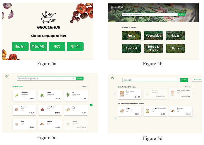
Once a user selects a language on the kiosk’s home screen (Figure 5a), they arrive at the search screen, where they can search for ingredients either by a direct keyboard search or by browsing by category (Figure 5b). When browsing by category, items are displayed and users can choose to sort them in various ways (Figure 5c). When searching directly for an ingredient, substitutable ingredients are presented on screen, which become especially helpful when the desired ingredient is out of stock (Figure 5d).

Task 2: Receive assistance with the process of communicating with grocery store employees who do not speak the same language(s) as the customer.
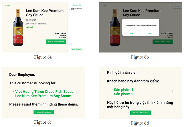
GrocerHub features a ‘shopping list’, which keeps track of ingredients that users save during their session. Figures 6a and 6b show the process of adding to the shopping list and viewing the shopping list. When the user wants to receive help from a store employee, they can request help, which will cause the system to show the list to an employee who can help them find the ingredients that they are looking for (Figure 6c, 6d). If the customer and employee face a language barrier, the list of ingredients can be translated into the employee’s language of choice.

In the revision process of our digital mockup, most of the changes were cosmetic such as making unavailable items less opaque (60% opacity to 40% opacity), enlarging pop-up windows to be more readable, and making terminology usage consistent throughout the application (“shopping list” instead of “list”). On the translated list page, we made the list of ingredients scrollable so that the design would gracefully support larger shopping lists. If you’re interested, an interactive version of our full digital mock-up of GrocerHub is viewable here: https://www.figma.com/proto/zxpwCcy2UF7elTcCbi8yWL/Kiosk-Mockup?node-id=27%3A672&scaling=min-zoom.
Concluding Thoughts
Food is a fundamental way for people to connect to their cultural heritage and identities. In an increasingly globalized world, members of diasporas continue to find it difficult to gain access to such a fundamental necessity. Our user research showed that the Vietnamese community in the Puget Sound area faces several barriers to access to groceries that force them to sacrifice forms of convenience in grocery shopping for necessity. GrocerHub will reduce this disparity in accessibility by making it easier for consumers to have the information they need to make decisions and simplifying and facilitating the process of communication in the grocery store. We envision that GrocerHub will help reduce the structural barriers that the Vietnamese community faces with access to groceries and will help make an activity that is integral to the human experience a little easier, a little faster, and a little more connected to home.
Citations
Koc, M., & Welsh, J. (2002). Food, Foodways and Immigrant Experience. Retrieved January 15, 2021, from https://www.researchgate.net/profile/Mustafa_Koc2/publication/253449347_Food_Foodways_and_Immigrant_Experience/links/0a85e52fe76e2cff51000000/Food-Foodways-and-Immigrant-Experience.pdf
