DRIP: Drip, Drop. Let’s Save a Lot
By Clarissa Choe, Abosh Upadhyaya, Vincent Liu

Problem Overview
Today, nearly 1 in 3 people live without enough water due to a growing population and global warming. To tackle this issue, our team at the University of Washington created “Drip.” It’s an easy-to-use tool that assists individuals and households track their water usage, set conservation goals and compete with friends to see who can save the most water. It connects to popular smart home appliances, so you can track anomalies too. We focused on Seattle homeowners who are not knowledgeable of water conservation as research showed that providing individuals with a sustainable solution to prevent water overuse would help mitigate extra water loss caused due to lack of knowledge.
Solution
To tackle water conservation, Drip approaches this in a savvy manner. Drip is an easy to use mobile application that tracks your water usage, sets conservation goals, and allows you to compete with your friends to reduce your water footprint! Plus, our app connects to popular smart home devices, so you can easily monitor and address anomalies.
Paper Prototype & Usability Tests
Initial Paper Prototype

Task #1: Comparing Water Usage to Other People

The first task we focused on was the social aspect that allowed the user to compare and share their own water usage with others.
Task #2: Offering Lower Water Consumption Technology

The second task encourages the user to find newer eco-friendly alternatives to the current washing machine that they are used to.
Initial Paper Prototype
We used the same layout for all three participants in our usability tests of the paper prototype. We first collected demographic information, including their familiarity with technology and apps. This helped us ensure a mix of skill levels in our testing. Next, we had participants complete two tasks: comparing their water usage with others and finding a more water-efficient washing machine. Finally, we asked for their thoughts on the prototype and areas for improvement.
Through our usability testing, we uncovered two glaring problems:
1. Addition of Changing Period of Time of Water Usage Data Displayed
Our previous prototype displayed only daily water usage for the household and per device, but users had questions about this. To remedy this, we reworked the interface onto a phone companion app that made the representation of the data larger. We also added dots on the bottom of the box to communicate to the user there are multiple pages and they can swipe to reach the different time periods.
These changes make it easier for users to access the data and reach their goal of viewing their water usage statistics. The dots indicating pages conform to external consistencies of other apps by having the dots on the bottom of the data to indicate pages.
2. Confusion On The Metrics For The Circle Indicating How Much Water Was Used
During testing, some users were confused by the circle that showed water usage metrics which was a critical issue. As water usage increased, the circle filled up based on the set goal, but this made users want to use more water to fill it up. We decided to change the design and show less filling as water is used, similar to a health bar. This helps users understand whether they are getting closer to or farther from their goal of using less water. We made this change because we want users to understand the goal is to use less water, unlike other goal-oriented activities like exercise.
Final Paper Prototype
Through feedback gathered from usability testing conducted with potential users, we developed a final iteration of our paper prototype. We chose a phone interface over a watch interface because we found users to be unfamiliar with smart-watches during usability testing. We felt it would be easier for users to accomplish the tasks with a larger and less confusing user interface. Figures 4 and 5 below depict our phone paper prototype.


Digital Mockup
Paper prototyping lets us quickly iterate through designs to settle on a polished design based on user feedback. However, to have quick iterations, the designs were less detailed. Using Figma, we transformed the final paper prototype to a HD detailed digital mockup. More attention was given to visual design aspects and the functionality of the application. Additionally, two important usability and interface improvements were incorporated based on feedback received from the final paper prototype.
1) Removal of Dropdown menus
In our paper prototype, we included dropdown menus to change the state of the app. Based on real-life experience and user feedback, dropdown menus are less manipulative on phones due to their small size. We changed the dropdown menus to clickable sliders that follow the conventions set by other IOS apps.
2) Addition of Detailed Information on Circle Graphs
Previously on the circular depiction of the data on the water usage, there was no information about what the circle represents. It just represented some percentage with no indication of what the statistic represents. Now, when users click on a circle, it will provide more details on what the circle represents. This change was important because it gives context to the users of what the circle actually represents.
Incorporating the above changes and adding visual design elements. The link to the digital mockup can be found on Figma here.
Overview

Task #1: Comparing Water Usage to Other People
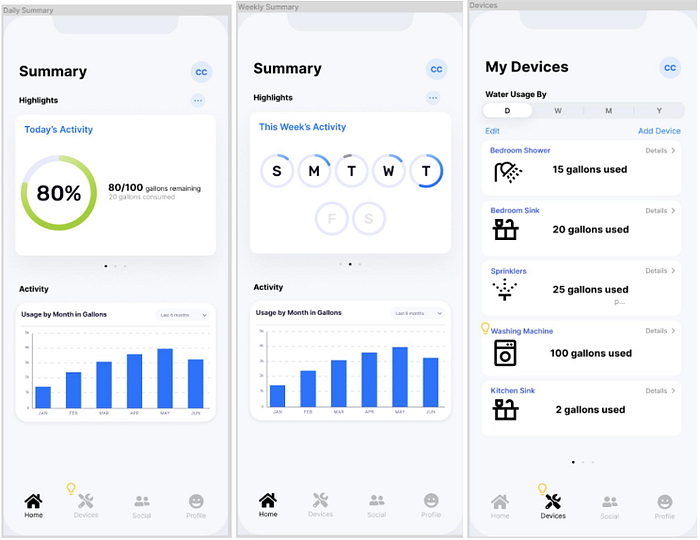
1) On the home screen when a user first opens the app, users can see a summary of their household’s water usage. It includes daily water usage and how they fair to their set goal. An adjustable graph showing monthly water usage is present. Users can view their own usage and compare it to others to see how much water they use relative to others.
2) By swiping left on today’s activity, users can look at the whole week’s overall water usage based on the goal they set. It shows how much water they used compared to the goal they set.
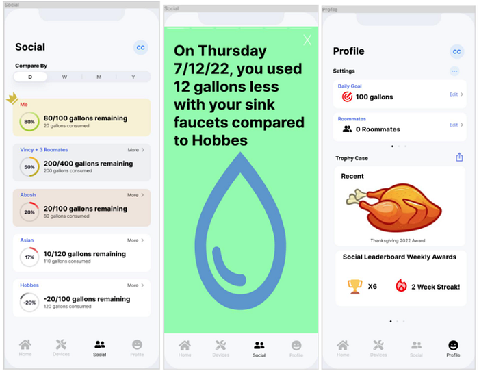
3) By clicking on social, users can see a leaderboard based on their water usage goals. They can compare daily, weekly, monthly, or yearly usage. The statistics allow users to see how much water each person/household is using and compare their own usage.
4) By clicking “more details” on a person’s water usage on the social leaderboard, a “story” pops up with detailed statistics for comparison. This is similar to Spotify Wrapped, but for water usage history. It allows more detailed comparisons with others on the leaderboard.
5) By clicking on the profile page, users can see the trophies they earned for reaching different goals or topping the leaderboard. Each trophy shows statistics about their water usage for that week. These trophies can be shared with one another and is another method for users to share their water usage.
Task #2: Offering Lower Water Consumption Technology
1) When users open the app, they can click on the devices. Currently, there is a lightbulb next to the devices tab because there is a recommendation that can help lower the user’s water usage.
2) After clicking on devices, users can see all the linked devices and the water usage data for each one. The time period of the data can be selected on the top. In this case, the washing machine has the lightbulb recommendation. Users can see that the washing machine is using a lot of water.
3) After clicking on the washing machine, users can see detailed statistics about its water usage. They can see daily and monthly usage and compare it to the horizontal average line on the usage graph. In this case, the user’s washing machine is using more water than average. Below, a bubble recommends considering more efficient options.
4) Swiping left or clicking the recommend button shows statistics for the current washing machine and provides data and a place to buy an alternative. Users can swipe left to see different alternatives recommended by the app. This page helps users find lower water consumption technology.
Summary
Many people in the Pacific Northwest do not have the depth of knowledge of water conservation practice as those who live in less water-abundant areas such as California. To counter this, we created Drip. Our solution sought to bridge this gap to provide a tool for people in more water-abundant places to practice water conservation tactics. User research showed that people are more motivated to conserve water if they can track their daily usage and compete with others. Drip allows users to track usage, set goals, and compete on a social leaderboard. By providing detailed information of their own participation in water consumption, people become aware of their water usage, motivating them to use less.
